In today’s modern, tech-driven world, we manage to create an incredible swathe of data every day. In fact, statistics from the World Economic Forum posts that at the beginning of 2020 alone, the amount of bytes in our digital universe was 40 times larger than the number of stars in the observable universe. It’s an astounding quantity that can be very difficult to wrap one’s head around.
That’s where data visualization comes in. Defined as the visual or graphical representation of information, it’s the best approach we have to make sense of the massive amounts of data we process on a daily basis and turn them into something more digestible. The power of visual data lies in its ability to beat common barriers in communication, such as language differences, time limits, legibility, and accessibility, and there are a lot of chart or graph maker apps out there that can help with this endeavor.
Which Visualization Type Should You Use?
Before getting started creating your chart, it’s important to know what the proper visualization will be appropriate. There are 5 big data visualization categories that can guide your selection:
1. Temporal
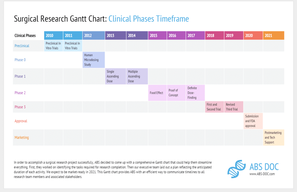
This category is composed of visualizations that satisfy two constraints: they are linear and one-dimensional. Alternatively known as timelines, they are characterized by events that happen during some time period or given moment. Samples of this type include: Gantt charts, stream graphs, concentric circle graphs, timelines, and line graphs.
2. Hierarchical
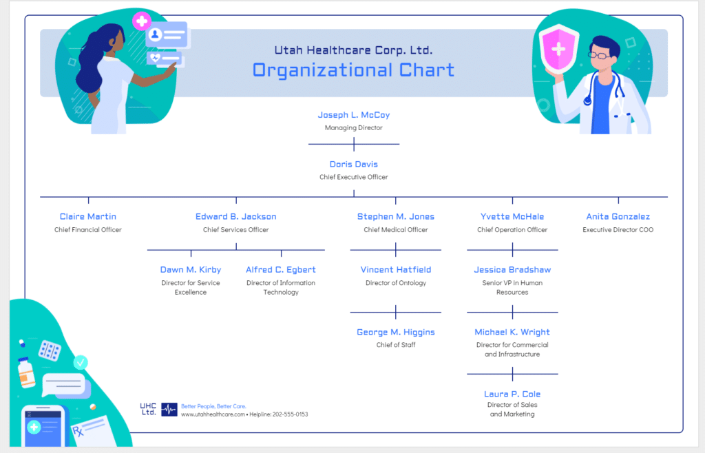
This category is for visualizations that have its data originate outwards from the root, which is an entity within the data that has no superior nor parent. It can also come in a form where data is categorized in a certain order. Samples of this type include: Tree diagrams, radial trees, cone trees, and flow charts.
3. Network
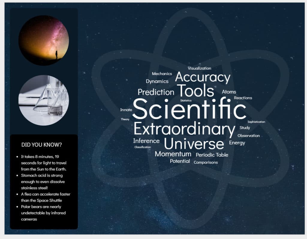
This category is made of visualizations that show and explain deep, complex connections between multiple datasets through visual representations. Entities are often represented as dots, with lines attaching related ones together, effectively highlighting the relationships between all of them. Samples of this type include Matrix charts, word clouds, and alluvial diagrams.
4. Multidimensional
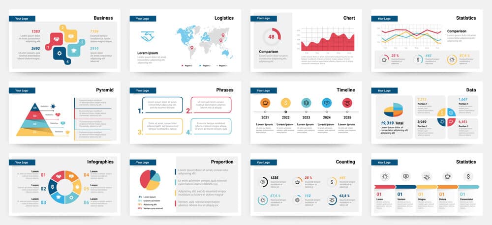
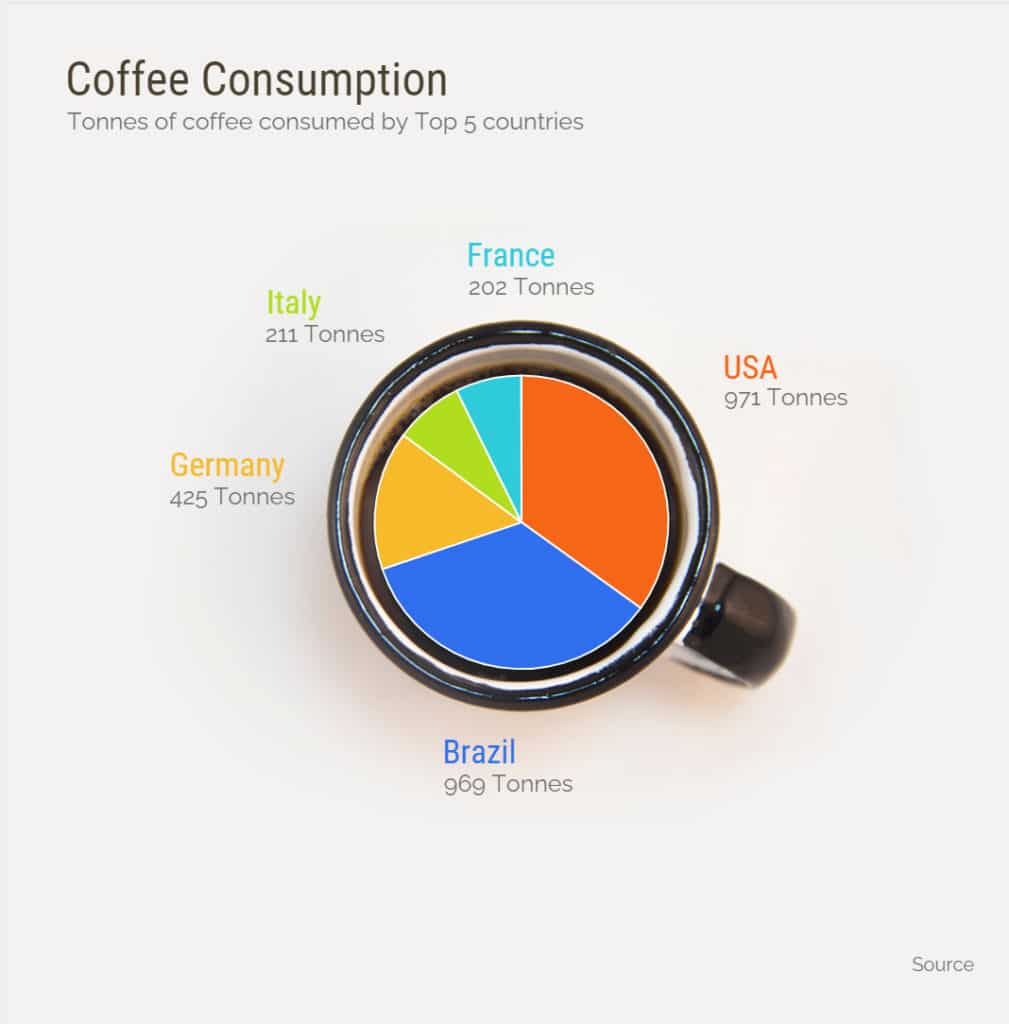
This category has visualizations that have two or more variables under consideration. It can also be split into two types: one which examines the relationship between the data’s variables, and another where proportions or counts are the focus. Samples of the former include heat maps, matrices, area charts, scatter plots, or line charts. For the latter, it can come in the form of pie charts, bar charts, histograms, and treemaps.
5. Geospatial
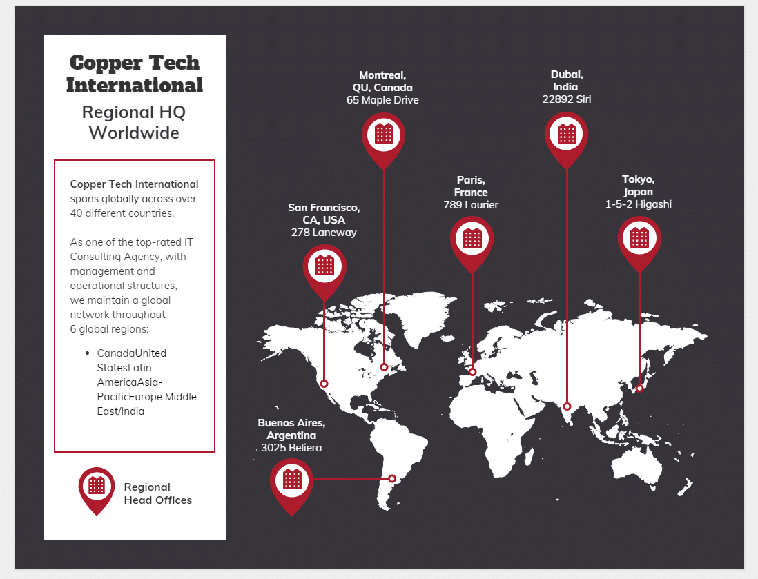
This category of visualizations is for when actual representations of locations are overlaid with different data points. Samples of this type include flow maps, density maps, and cartograms.
Creating a Data Visualization Chart
Once you’ve identified the type best suited to your data, the next step is to actually create the chart. Online tools abound when it comes to data visualization, and here are some of the most user-friendly sites:
1. Venngage
Made specifically for business professionals who are looking for a visual solution to convoluted communications. Venngage is an online, infographic designing platform that allows its users to select premade, data-focused image or chart templates and customize them as needed. It makes designing charts accessible.
2. Adobe Spark
An online generator capable of creating a quick and very simple-looking pie chart, donut chart, line graph, or bar graph. Best used for pure utility, as it has no striking visual elements in place.

3. Google Data Studio
A feature of the Google Analytics Suite, its main purpose is to assist in converting data into customizable, intuitive, and interactive visual reports and dashboards. An optimal choice when processing huge amounts of data.
Improving on Your Charts and Graphs
Effective data visualization is an exercise in clear, concise, and targeted reporting. People naturally take to images much faster than text, and it takes a lot less attention and effort to do so.
It’s all about making sure you are able to curate your data then present it in such a way that it tells a story, or makes a statement without taking up too much time nor space to do so.
Aside from that, good data visualization also incorporates and takes advantage of basic design principles in order to highlight pertinent key points to more effectively disseminate information.
The goal is to really capture and communicate as quickly as at first glance, and the best way to do that is to ensure you have elements in place that will direct your audience’s attention to where you want them to go.
In the end, there is no one correct way; data visualization is as much an art form as it is a scientific one, but as long as your data is matched to an appropriate visualization then there shouldn’t be an issue.