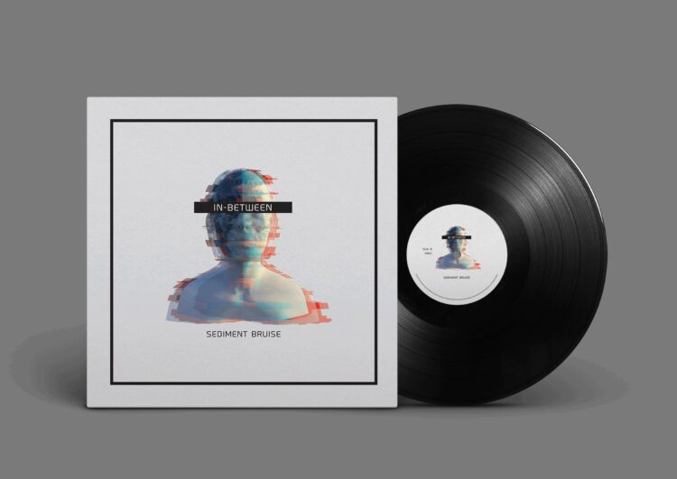
Having an amazing release cover is essential for you to be featured and recognized on platforms such as Spotify, Apple Music, Beatport, YouTube Music, and more. Let’s face it, even if your music is amazing, you may not get featured or even noticed if the release cover doesn’t look the part. If you wish to design a stunning release cover, there are some quick tips to ensure that you have the best product possible before your release goes live.
#1 Quality Imagery
Make sure your release has quality imagery, which is the backbone of a great cover. Nobody wants to see a dull, stretched-out, pixelated cover. Great covers have images that fit the subject, have great lighting, and boast eye-catching images. Therefore, if you’re going to use what you’ve photographed or designed yourself, take care to evaluate its quality prior to using your pic as a cover.
The images also need to fit the correct dimensions. Don’t try to take a 300:200 pixel image and stretch it to fit a 2000:2000 pixel space. This will detract from the quality of your image which will pixelate, become blurry, or otherwise deteriorate.
#2 Use Professional Typography
Make sure you’re utilizing professional typography. One thing we see more often than not is a cover with a great concept and execution, but the main text is either misplaced or isn’t in alignment with the main composition. Typefaces, or fonts, can be beneficial in helping you portray a feeling or enhance the overall concept. So, be sure to choose them wisely.
Furthermore, you need to ensure that the chosen font makes sense within the design and is in congruence with its other elements. For example, a grungy typeface on top of a clean and simple sci-fi background may not work as well as a more techy monospaced typeface.


And by all means, don’t just slap the text on top of your album cover, either. Take care to put some thought into it, as the text on the cover is usually the first thing a person’s eye would be drawn to. If you’re at a loss for ideas, try tapping into the power of a modern album cover maker.
#3 Create an Eye-Catching Design
Let us first start by saying, eye-catching is definitely a subjective term. In other words, what’s eye-catching to you might look gloomy and insipid to your client, and so. So, it would be wise to opt for something that is considered eye-catching by most people. For this, think back to some of the most influential release covers of all time, say, Nirvana’s Nevermind album, Pink Floyd’s Dark Side of the Moon, or Nas’ Illmatic.


These release covers pushed boundaries and appeared truly revolutionary in their unflinching intention to stir emotions in the public. You also shouldn’t be afraid to experiment. Try something different. Make your audience stop in their tracks and want to take a listen just based on the look of your cover.
#4 Make It Original
No one wants to get lost in the endless sea of music releases. Stand out, be unique, and try something off the wall. As we’ve noted, drawing inspiration from classics is a great idea. Nevertheless, you should take care not to imitate or inadvertently emulate your favorite icons. Be sure, if you put enough effort and time into designing a unique cover, lots of people will stop by and take interest in it merely because of its visually appealing look.
Do some research, see what your competitors are doing, and do the complete opposite. Well, not maybe the exact opposite, just make sure not to mimic the designs of top sellers in your industry. This might put off your listeners and inhibit your creative potential.
#5 Strive for Visual Balance
Visual balance is essential since it provides a sense of unity, order, and equilibrium. All subconsciously called upon by your brain. Your design needs to visually hold together to feel complete and coordinated. With that being said, balance does not necessarily mean complete symmetry. There is also asymmetrical balance, radial balance, and crystallographic balance, which is also called mosaic, or allover balance. And each one has its own unique characteristics.

Don’t just throw everything onto your release cover in a scrambled manner. Think about where things are going and their relationship with one another. if your design is a jumble of incongruent elements, it will detract from your reputation and likely may your potential listeners to skip your album.
Remember, people tend to eat with their eyes first and then dive in to taste the experience in its entirety.


