YouTube Music for Android has just introduced a sleek redesign of its share sheet, enhancing user experience and making sharing easier than ever. In this article, we’ll delve into the details of this update and how it impacts the functionality of the app.
Overview of YouTube Music for Android
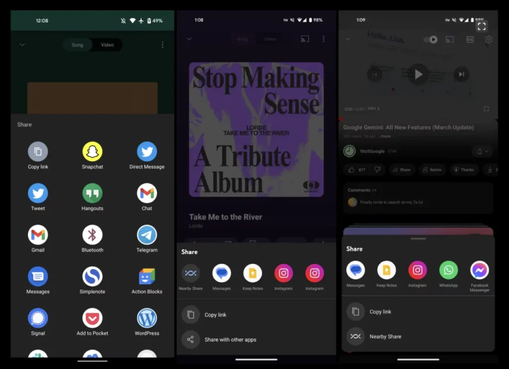
YouTube Music for Android has always stood out with its unique design language, distinct from other Google applications. This trend continues with the recent redesign of the custom share sheet. Traditionally, tapping the “Share” button would open a grid-based sheet, occupying a significant portion of the display. However, the latest update brings a more compact and efficient share sheet to the app.
App Redesign
The redesign of the share sheet reflects YouTube Music’s commitment to providing a seamless and intuitive user experience. Previously, users were greeted with a grid-based layout that consumed a large portion of the screen when sharing content. Now, the share sheet is much smaller, featuring a carousel that displays around five targets per screen. This design not only conserves screen real estate but also enhances one-handed usage.
Share Sheet Changes
One of the notable changes in the share sheet redesign is the relocation of the “Copy link” option, which was previously nestled within the grid layout. Now, it sits prominently below the carousel, alongside the option to “Share with other apps“. This streamlined approach makes it easier for users to copy links or share content with external apps seamlessly.
What’s New in the Share Sheet Redesign?

Easier Sharing Options
With the new share sheet design, sharing content from YouTube Music for Android has become more straightforward. Users can quickly access sharing options without navigating through a cluttered interface. The carousel layout allows for effortless browsing, ensuring that users can share their favorite tracks or playlists with just a few taps.
Improved User Experience
The revamped share sheet not only enhances usability but also improves the overall user experience. By reducing the share sheet’s size and optimizing its layout, YouTube Music for Android ensures that sharing content feels seamless and intuitive. Whether users are sharing a single track or curating a playlist for friends, the updated share sheet makes the process smoother than ever before.
Integration with Other Apps
Another highlight of the share sheet redesign is its seamless integration with other apps. The option to “Share with other apps” opens the system Share sheet, allowing users to share content across a wide range of platforms and services. Whether it’s sharing a song on social media or sending a playlist to a messaging app, the redesigned share sheet facilitates effortless sharing across various platforms.
In conclusion, the redesigned share sheet in YouTube Music for Android represents a significant step forward in enhancing the app’s usability and functionality. With its streamlined layout, easier sharing options, and seamless integration with other apps, the updated share sheet ensures that users can share their favorite music effortlessly.


